For most designers doing up a bedroom is probably the most challenging part of any home. Think about it !! The things that go into most living rooms are sofas, coffee tables, paintings accessories side tables etc. And all these put in any permutation and combination does not change the functionality of the room. A living room will always function as a living room and dining room will always function as a dining room. But a bedroom can take on many roles. One, of course, is by the virtue of its name- a resting room. It can also double up as a study, a TV lounge or a dressing room.
Here is was one such room CUBS got to design. When CUBS met this customer she just had one thing to tell us
“I exactly know how I want my room to look. I have jotted down all my designs. All I need from you guys is to fill in the gaps”
Seldom do we get customers who are so spot on about their requirements and designs. A CUBS delight to work with such customers. And so it began…
CUBS Analysis
It had the basics- a queen sized bed with side tables, a dresser, a study table and a wardrobe. A lot of small things were spilling out here and there- on the bed, above the wardrobe, the available tops of dresser and side tables. The dark brown wardrobe that covered an entire wall looked heavy for that size of a room. The bulky, black office chair, the deep brown bed and curtains brought a gloom to the air.
Client essentials
- Detailed sectional elevations of cupboards, bed, study, shelves etc.
- Colour palette
- Rocking chair for the room
- Complete wall to wall design
[/vc_column_text][vc_column_text]
Before
[/vc_column_text][vc_single_image image=”6322″ img_size=”593″ alignment=”center”][vc_column_text]
After
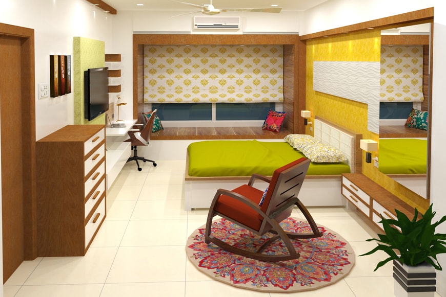
[/vc_column_text][vc_single_image image=”5213″ img_size=”full” alignment=”center”][vc_column_text]
Design Board_1
[/vc_column_text][vc_single_image image=”5214″ img_size=”593″ alignment=”center”][vc_column_text]
Design Board_2
[/vc_column_text][vc_column_text]CUBS Chronicles
- The room had to feel a little lightweight. Thus the central deep, brown colour for the space was replaced by a tint of yellow.
- Locations of main furniture i.e. the bed, wardrobe and study table were retained since they worked well for movement within the room.
- The wardrobe was redesigned. The four doors were replaced by two leaf sliding shutters. The shutters are a playful composition of glass with a side margin of the jacaranda coloured wood.
- White shutters were provided for the existing lofts.
- One of the four vertical planes forming the room is an edge to edge bay window pushed out through a niche’ that creates a seating ledge. This niche’ has been wood paneled with the same jacaranda coloured laminate which in a way makes this romantic window a special corner of the room. It is furnished with floral cushions (pepperfry.com).
[/vc_column_text][vc_single_image image=”5218″ img_size=”593″ alignment=”center”][vc_column_text]
Cushion covers from pepperfry.com
[/vc_column_text][vc_column_text]
- The wall behind the headboard is the only wall visually designed for an emphasis. It is done with yellow marble stucco paint and off white MDF texture board panel. The wall is lit with a row of spot lights from the ceiling.
[/vc_column_text][vc_single_image image=”5215″ img_size=”593″ alignment=”center”][vc_column_text]
MDF Textured board & Marble,Stucco paint from Asian Paints
[/vc_column_text][vc_column_text]The black office chair for the study table was replaced by a sleek, white executive chair (from urbanladder.com).[/vc_column_text][vc_single_image image=”5221″ img_size=”593″ alignment=”center”][vc_column_text]
Ray Executive Study Chair by urbanladder.com
[/vc_column_text][vc_column_text]A rocking chair (from urbanladder.com) has been added to the open space in the centre. It sits on a traditional hand tufted carpet (from pepperfry.com) One can lie down on this chair and watch T.V or just gaze out of the distant window with a cup of tea.[/vc_column_text][vc_single_image image=”5219″ img_size=”593″ alignment=”center”][vc_column_text]
Dylan Rocking chair by urbanladder.com
[/vc_column_text][vc_column_text]A traditional multicolored hand tufted carpet from Pepperfry thrown under the Dylan rocking chair makes the small space seem a lot larger than it actually is.[/vc_column_text][vc_single_image image=”5220″ img_size=”593″ alignment=”center”][vc_column_text]
- Bedside ledge with drawers, chest of drawers and a tall mirror with shelves behind it, were introduced to increase storage space so that nothing spills out on table tops.
-by Saket Mehendale.
I am a 34 year old self taught artist and academically a landscape architect, from Pune. I received my training in drawing as an extra curricular class in high school. After two years from graduation did I turn to drawing more seriously as a form of exploration. I liked working in dry media like graphite, charcoal and pastels and have dabbled hands in water colours. The first collection of drawings of Himalayan landscapes was exhibited in August 2009 and the encouraging response and the urge to create more, set the ball gradually rolling. Nature being the all-time inspiration my subject matter explored nightscapes, trees & parks, Konkan and water lilies in consecutive collections and art shows. I think drawing as a form of art is strongly driven by intuition unlike the field of design which became academic and professional parallel. I admire the arts because they are free will expression that need not require to be explained. In future I hope to explore more subjects in art.[/vc_column_text][vc_column_text]
Traditional hand tufted carpet by pepperfry.com
[/vc_column_text][/vc_column][/vc_row]
