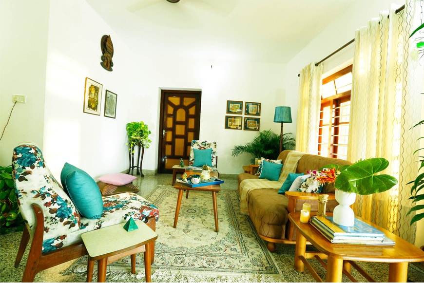
 A type of furniture or way the home is kept is a testament to one’s stage in life. Coming from a generation where one believes that furniture sets have to match, furniture of the same type have to be kept in one room and the seating arrangements have to be traditional, it’s very difficult to break that ingrained mindset. Here was one such couple in the early sixties who had this to say
“We are used to a regular lawyer room arrangement. Anything too trendy is not something we can relate to”
Fair enough!! One thing that’s clear is the makeover has to be something that’s from a perspective of a generation who believe in making the living space, a place where families bond and make memories over a cup of tea.
CUBS Analysis
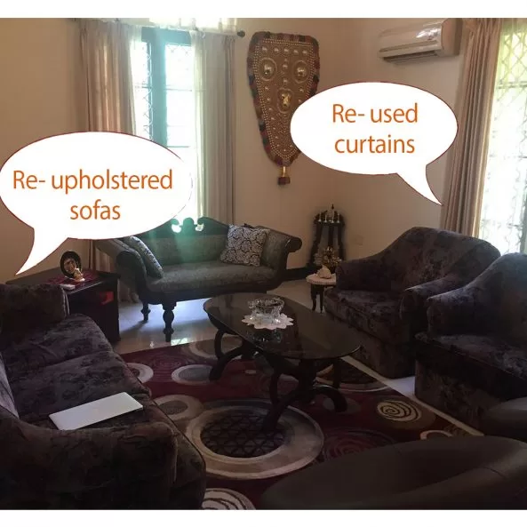
The existing interiors were a mix of international style sofa set with a traditional bench along with a few big vernacular accessories. The furniture was bulky and its dark brown colour brought gloom to the poorly lit room. Overall there was a sense of heaviness in the space.
Client Essentials
- The sofa set was to be retained.
- Reuse of Brown chairs.
- Reuse traditional terracotta pottery.
Before
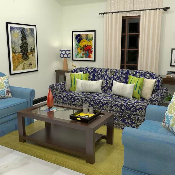
After
[
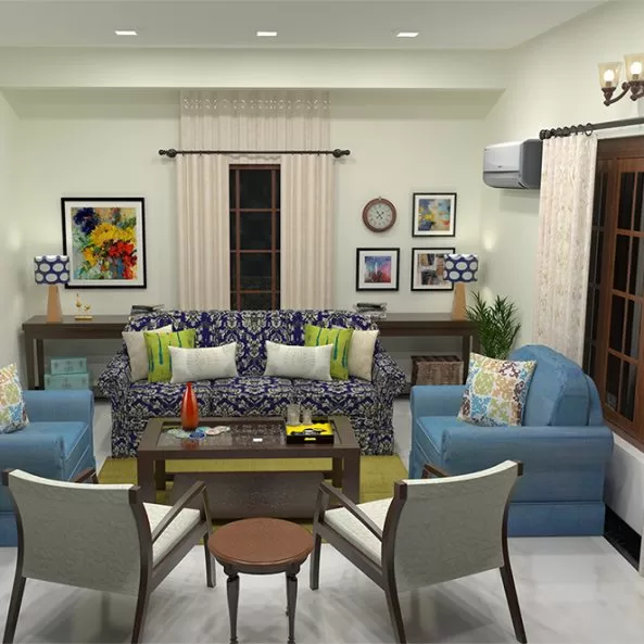
Design Board_1
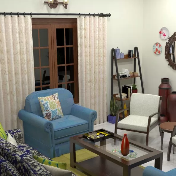
Design Board_2
Design Board_3
CUBS Chronicles
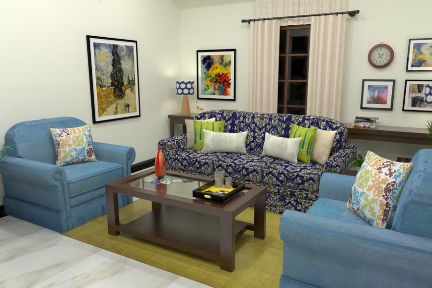
- We preferred to carry forward with one style instead of a mix and thus made the modernist sofa set as the main seating layout. The traditional bench and elephant caparison wall hanging were essentially removed.
- The dark fabric of the sofa was redone with blue- a receding colour. The central three-seater was specially redone with a different fabric. It broke the monotony.
- To support the seating style, a simple, traditional console table was introduced (woodenstreet.com)
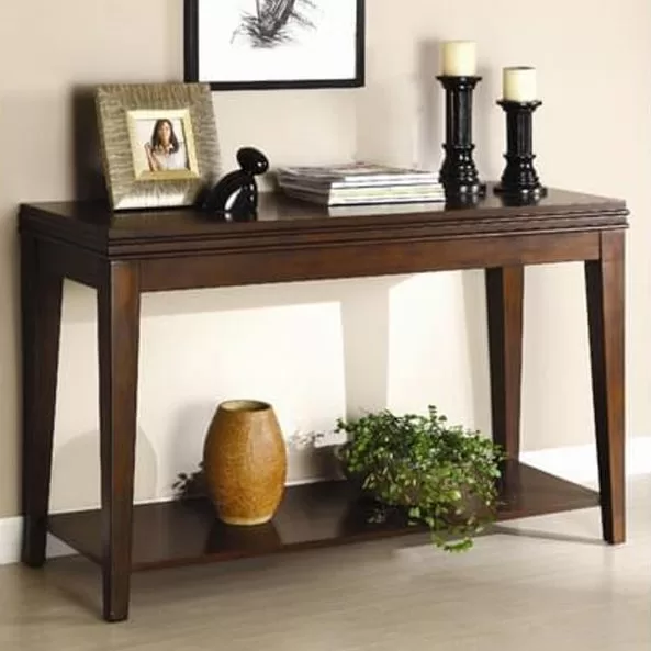
Image Credit: www.woodenstreet.com
A plain carpet (pepperfry.com) in olive green, also a receding colour, formed the base for the C-shaped seating.

Image Credits: www.pepperfry.com
Ladder shelf (from woodenstreet.com) was the quirky addition to an otherwise formal, grand room.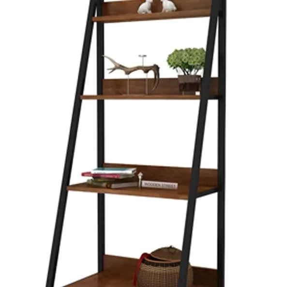
Image Credits: www.woodenstreet.com
Mild steel wall clock and storage trunks (amazon.com) added a charm of vintage collectibles to the living room of a grand bungalow.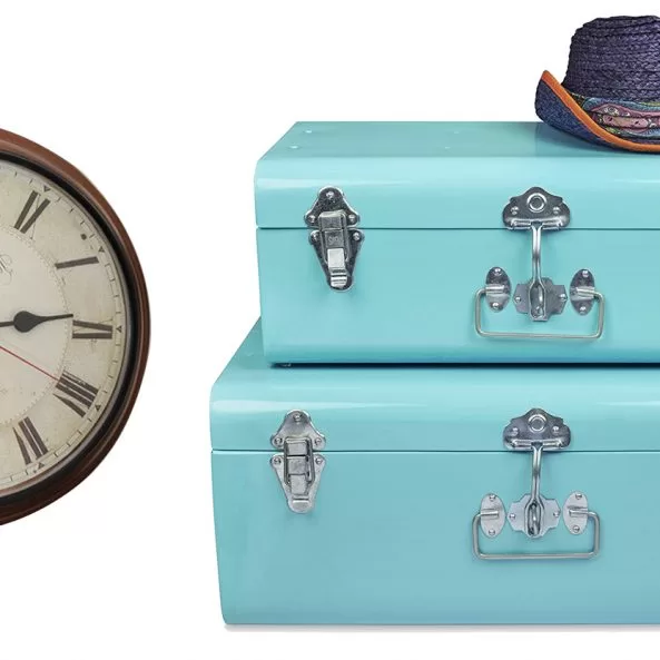
Image Credits: www.amazon.in
- The paitings above the consoles create a much needed colourful focal point.
- Throwing a few white cushions on the blue couch completed the spread of white colour nearly throughout the formerly darkish room.
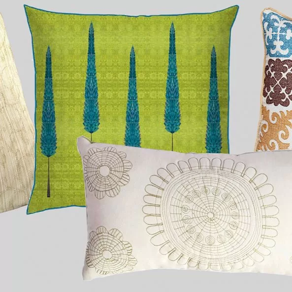
Image Credits: Pepperfry, Masalaworks, Zufolo
- Unique colourful wall plates from Cyahi (www.cyahi.com) can brighten any dull corner. It can also be used to pack up a blank space.
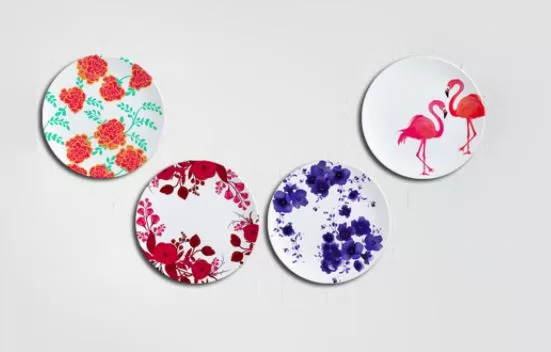
Image Credits: Cyahi
- The paitings (www.art4u) above the consoles complete the much needed focal point. The clock placed along with the paitings add the quirk.

Image Credits: Art4u
Are you inspired? Want to get a room makeover in a budget? Please shoot us an email at info@cubspaces.com. CUBS will help you re-imagine your space one room at a time.
-by Saket Mehendale.
I am a 34 year old self taught artist and academically a landscape architect, from Pune. I received my training in drawing as an extra curricular class in high school. After two years from graduation did I turn to drawing more seriously as a form of exploration. I liked working in dry media like graphite, charcoal and pastels and have dabbled hands in water colours. The first collection of drawings of Himalayan landscapes was exhibited in August 2009 and the encouraging response and the urge to create more, set the ball gradually rolling. Nature being the all-time inspiration my subject matter explored nightscapes, trees & parks, Konkan and water lilies in consecutive collections and art shows. I think drawing as a form of art is strongly driven by intuition unlike the field of design which became academic and professional parallel. I admire the arts because they are free will expression that need not require to be explained. In future I hope to explore more subjects in art.

